Home Page Design
Welcome to my home page, how can I help you? Your home page is critical to helping users find what they are seeking. Users see the home page as a road map for your website. The eye scans frantically around looking for a foothold. If you’re monitoring your website, it’s not a compliment to have users stay on your home page for a long time. They should keep moving, finding more information on additional pages. Longer time periods on the home page mean that users aren’t finding what they are looking for fast enough. Instead they should be rapidly moving across the page then rapidly clicking to get additional information. Your objective should be to get users to click for more information in less than 3 seconds.
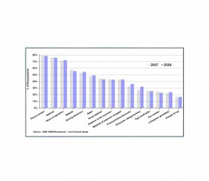
If you have a single page website, it should have all the necessary information that people are looking for such that they will give you a call, swing by, or respond to another call to action. But keep in mind that the “About Us” and “Products” buttons always get a lot of clicks, so add them if you can. Some things that your potential customers are looking for are listed below.
Make your address and especially, your phone number readily available on the home page.
Your website should be three or less columns, preferably two. Each column should be no more than 65 characters across. Visual flow should be vertically down the page, not across it. Make the text on the page “pop”! Don’t hesitate to utilize white space.
Use bullets wherever possible. Users can easily scan down lists of bullets. Bulleted copy gets better comprehension than paragraph text. Search engines see bullets as more important than paragraph information on your page. Don’t hesitate to breakout the key points of your paragraph copy into bullets as well.
Your home page should have an immediate call-to-action. If you’re selling something, put a special on your home page. Statistics show that 40% of products sold happen directly from the specials on the home page. It’s no mystery that Amazon lists products of interest to you when you return. The call to action can also be in the form of Q&A forms, white paper offers, “subscribe to our newsletter”, or request an evaluation.
Make minimum use of graphics. Studies show that the human eye utilizes your graphics within 1/10th of a second then begins searching for text.
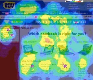
The eye tracking chart to the right shows that the user did not focus on any graphics. They were simply used for verification that the customer was on the right page, then immediately they searched for the text. The top and left hand side of the pages were searched for additional information, which is where your navigation buttons should be.
Avoid large graphics. You should use graphics only as a visual cue and keep them small. This will also speed up the load time of your site. If you use a photo of a person, it needs to be a professional woman with a caption. You will get 300% more attention using a photo of a woman than a man. The caption will often get more attention than large headers on the page.
Click tracking studies show that users will click anywhere on your page. Make almost everything clickable on the page to somewhere relevant if possible. Don’t allow clicks to be wasted!
By Carl Perkins, CEO, Performance Media Placement


I’ve also noticed that each and every year, there has been significant growth and development of web page design and in 2011 we can easily potentially see yet another significant leap for website design. A combination of developments in website performance and expansion of user platforms could produce a new wave of functionally integrated internet websites suitable for multi-platform usage. Thanks